A Rainy Afternoon Film List Built Around One Colour
Build a rainy afternoon film list around one colour, using visual contrast to choose varied films and give a cosy home screening a clear thread.
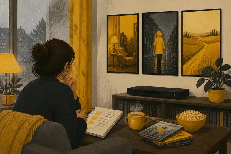
Rain taps the kitchen window while a mug of tea cools beside a notebook. For a rainy afternoon film list, choose one colour as a visual thread, then let contrast—not matching plots or genres—shape the viewing. A colour can appear in a room, a costume, a landscape or a single striking object. The aim is not to find films that look alike, but to notice how different filmmakers use the same hue.
Start with a colour
Pick a colour you can recognise in more than one mood. Red might feel warm in a lamp-lit interior, severe in a warning sign or playful in a costume. Blue can suggest open air in one scene and cold artificial light in another. Green may belong to a garden, a painted wall or an unsettling glow. A useful choice has enough visual range to make contrasts possible.
Begin with what you already feel curious about. Perhaps a colour reminds you of a favourite coat, a room you once lived in or the first flowers in a park. That personal association gives the afternoon a starting point, but it need not dictate the films. Let the screen complicate your first impression.
For this walk-through, imagine that Mara has a free, rainy afternoon and chooses yellow. She likes the colour but associates it mainly with cheerfulness. Her aim is to see whether it can carry other feelings too. She plans a small list of three films, each chosen for a different visual use of yellow rather than for shared subject matter.
Make contrast do the work
Mara writes three prompts in her notebook: yellow as comfort, yellow as interruption and yellow as distance. These are viewing lenses, not categories a film must fit neatly. The first might lead her towards a warm interior or lamplight. The second suggests a sudden costume, sign or prop that catches the eye. For distance, she looks for a colour spread across a landscape or softened by haze.
This method keeps the list varied. One film may be a comedy, another a mystery and another a quiet drama, but their genres are incidental. The connecting question is what yellow does inside each image. Does it invite the eye to rest, pull attention away from a face, or make a place feel far off? Asking that question lets the afternoon become a small exercise in seeing without turning it into homework.
She then checks which films are actually available to her. Mara scans the shelves at her local library, looks through the films already saved in her streaming account and asks a friend for one suggestion. She does not assume a title will suit the plan because of its poster; a vivid cover can promise a colour that barely appears on screen. If she is unsure, she checks a trailer or a few stills, then keeps the choice provisional.
Build a three-film arc
For the first slot, Mara chooses a film with an inviting, familiar use of yellow. She wants to begin gently, with a colour that feels close rather than grand. As she watches, she notices the shade’s neighbours: cream, wood, shadow or another warm tone. The surrounding colours matter because yellow does not create a mood alone.
For the middle slot, she picks something with a sharper visual contrast. Imagine that she chooses a story whose interiors are mostly muted, with a bright yellow raincoat appearing whenever a character steps outside. The raincoat becomes an interruption in the frame. It does not need to explain the plot; Mara simply notices how quickly her eye returns to it, and whether that attention changes when the coat disappears.
For the final slot, she looks for yellow used at a greater visual distance: perhaps a field, a stretch of desert or evening light spread over a street. She chooses a film with a slower rhythm, so the colour can sit in the image without needing to signal a sudden change. The finish feels different from the opening, even though both films use the same hue.
That order gives the afternoon a loose movement: near, striking, far. It is not a rule that every list needs to follow. If the available films suggest another sequence, follow that instead. The useful point is to give each selection a distinct reason to be there.
Keep the list flexible
A themed list can become fussy if every choice must pass a strict test. Mara gives herself a simple filter: can she name one visual moment or setting that makes the film relevant, and does it offer something different from the other choices? If the answer is yes, the title can stay. If the connection depends only on a poster or a vague colour association, she replaces it.
- Look beyond the cover: Check a trailer or stills for a sense of how the colour appears in the film.
- Vary the setting: Mix interiors, streets and open landscapes where possible.
- Vary the intensity: Pair a strong block of colour with a subtler use of the same hue.
- Leave room for mood: Avoid choosing three films that all create the same emotional effect.
- Keep one spare title: A reserve makes it easy to adjust if a film is unavailable or no longer appeals.
These checks are there to support curiosity, not to police it. If Mara finds that a film barely contains yellow, she can still keep it if the absence itself becomes interesting. Perhaps the colour appears only in a brief scene, or a bright yellow object feels startling because the rest of the image is restrained. A theme often becomes more revealing when one choice resists it.
Questions for a colour list?
How do I choose a colour for a film afternoon?
Choose one you can imagine appearing in different settings, rather than one tied to a single kind of scene. A personal association can help you begin, but let the films complicate it.
Do all the films need to share a genre?
No. Variety in genre can make the visual connection easier to notice, since the colour is doing the linking. Choose each film for a different use of the hue, not for a matching plot.
What if the colour appears only briefly?
A brief appearance can still be worth noticing if it changes how the image feels or where your attention goes. Keep the film if that moment offers a distinct angle on the theme.
How many films should I plan?
Choose a number that suits the afternoon and your attention, then keep a spare option if you want flexibility. A small list with clear contrasts can be more satisfying than a long list of near-matches.
Let the afternoon breathe
Mara sets out her three choices, a notebook and a pencil, but leaves the notebook closed during the films. Between screenings, she takes a short break and writes down one observation: where yellow appeared, what sat beside it and whether its mood changed. A few words are enough. She does not need to catalogue every scene or search for a single correct interpretation.
If she wants to make the viewing social, she can invite a friend to choose the spare title or ask what colour they noticed first. They may focus on different details: a lampshade, a scarf, a sunlit wall. That difference gives them something concrete to discuss without turning the occasion into a quiz. For a solo afternoon, a handwritten list on the coffee table can serve the same purpose.
By the last film, Mara’s idea of yellow has widened. It still feels warm in some images, but it can also interrupt, recede or make a landscape seem strange. Her rainy afternoon film list has worked because the colour was a question to carry from one film to the next, not a promise that every film would look alike. Next time, she can choose another hue and start with a different assumption.
Keep the notebook page with the titles and observations. It gives you a ready-made starting point for another rainy afternoon: not a ranking to defend, but a record of what caught your eye. The most useful colour thread is the one that leaves you curious about what you might notice next.